
Brief
Design the visual identity for the green butterfly foundation, created to provide a consulting platform to enable and assist throughout visuals, branding, social media and news coverage innovative green projects.
I started the project by researching the brand attributes and then elaborate different style scapes with different themes and design aesthetics. The last one resulted on the client preferences and needs.
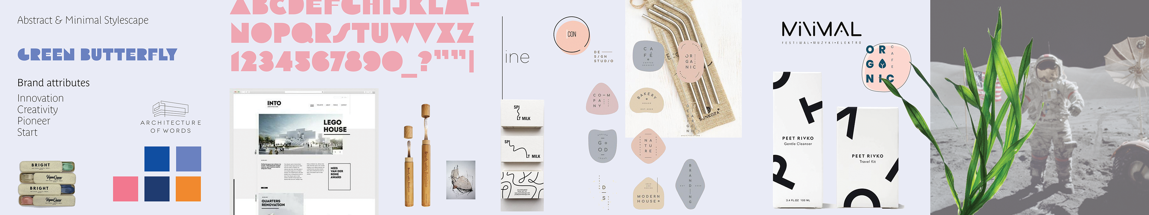
Abstract Minimal Stylescape
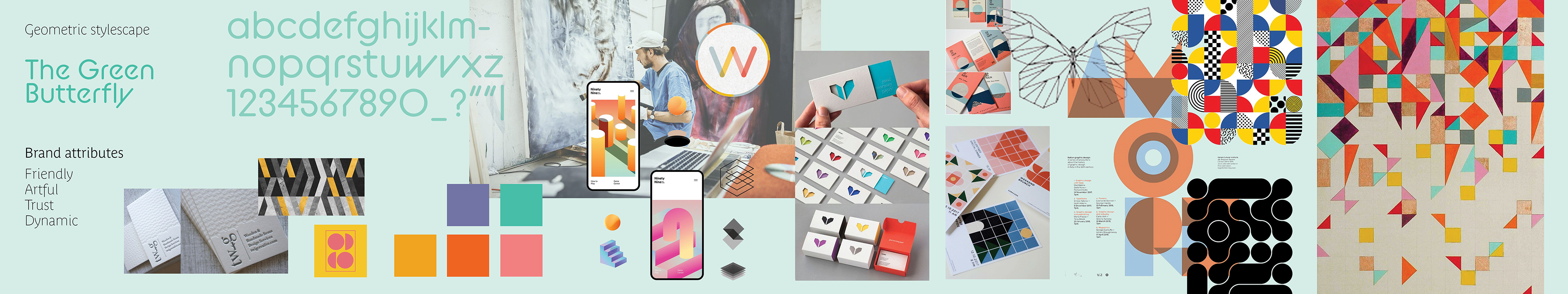
Geometric Stylescape
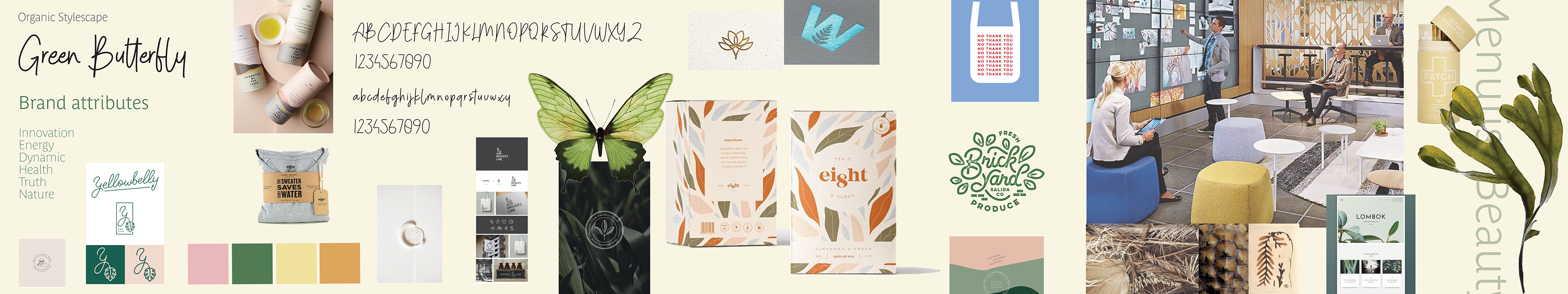
Organic Stylescape
After the clients have chosen their favourite stylescape – the geometric stylescape – I started to develop different concepts based on the feedback.
1st Design Proposal
1st proposal design TGBF
1st proposal design TGBF
1st proposal design TGBF
1st proposal design TGBF

1st proposal design TGBF
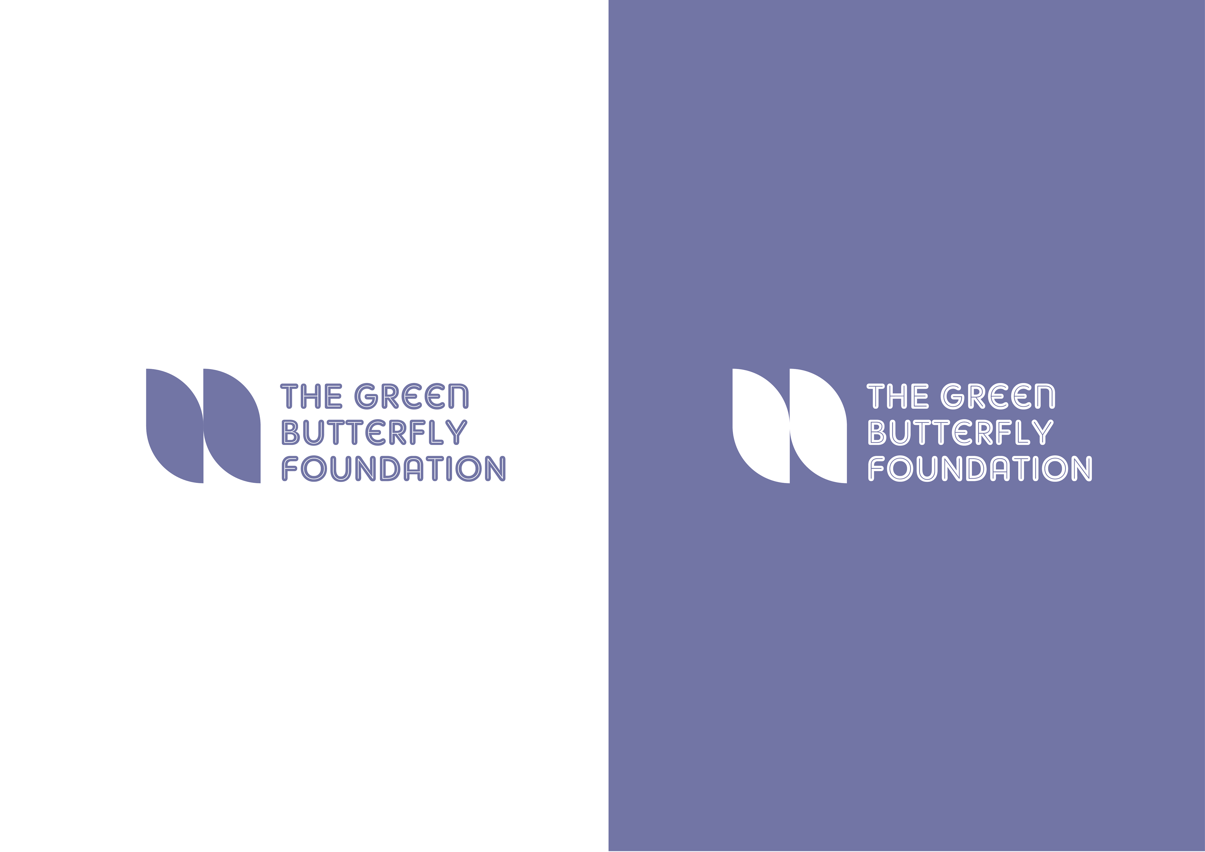
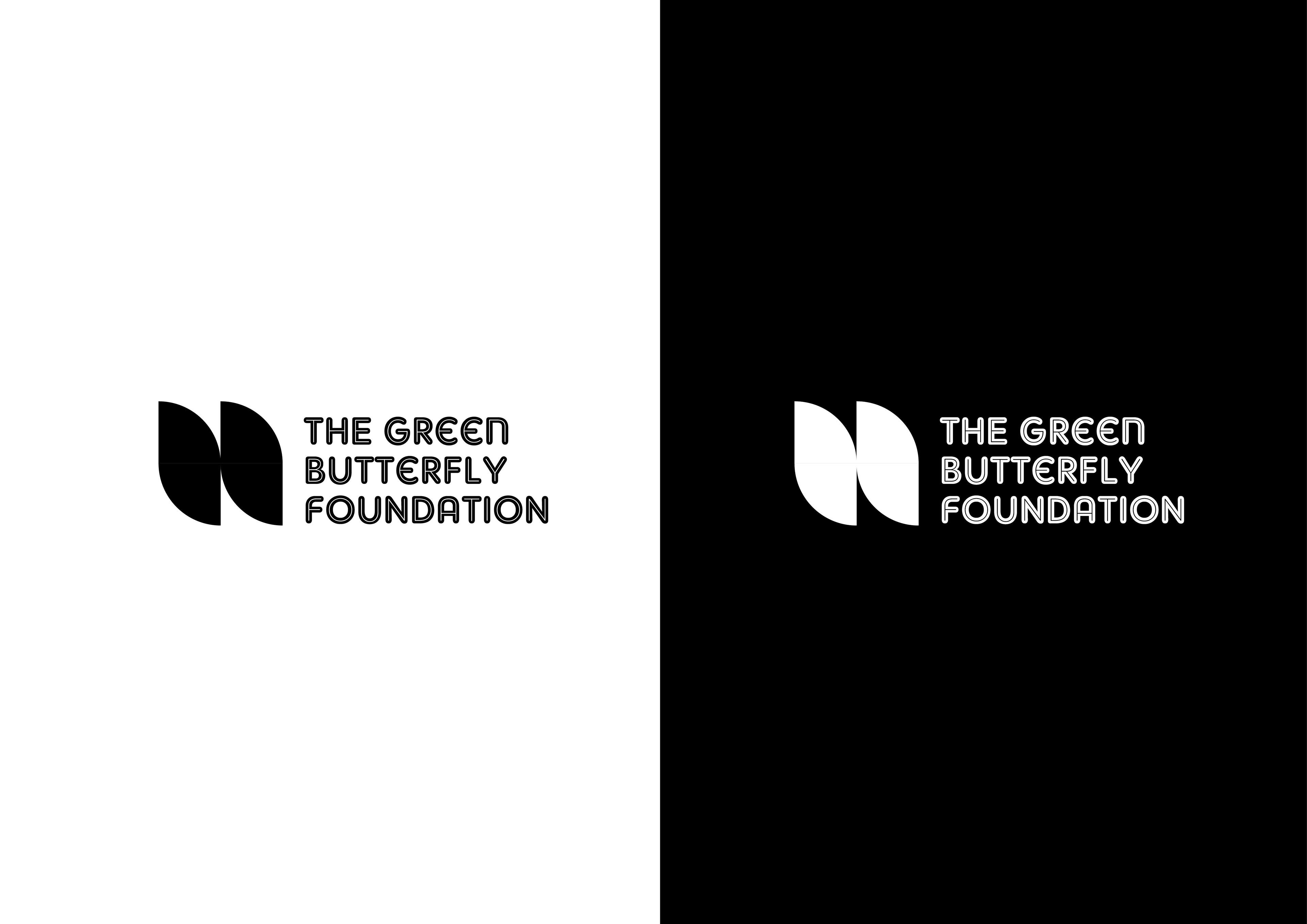
2nd Design Proposal
2nd proposal design TGBF
2nd proposal design TGBF
2nd proposal design TGBF
2nd proposal design TGBF
2nd proposal design TGBF
3rd Design Proposal
3rd proposal design TGBF
3rd proposal design TGBF
3rd proposal design TGBF
3rd proposal design TGBF
3rd proposal design TGBF
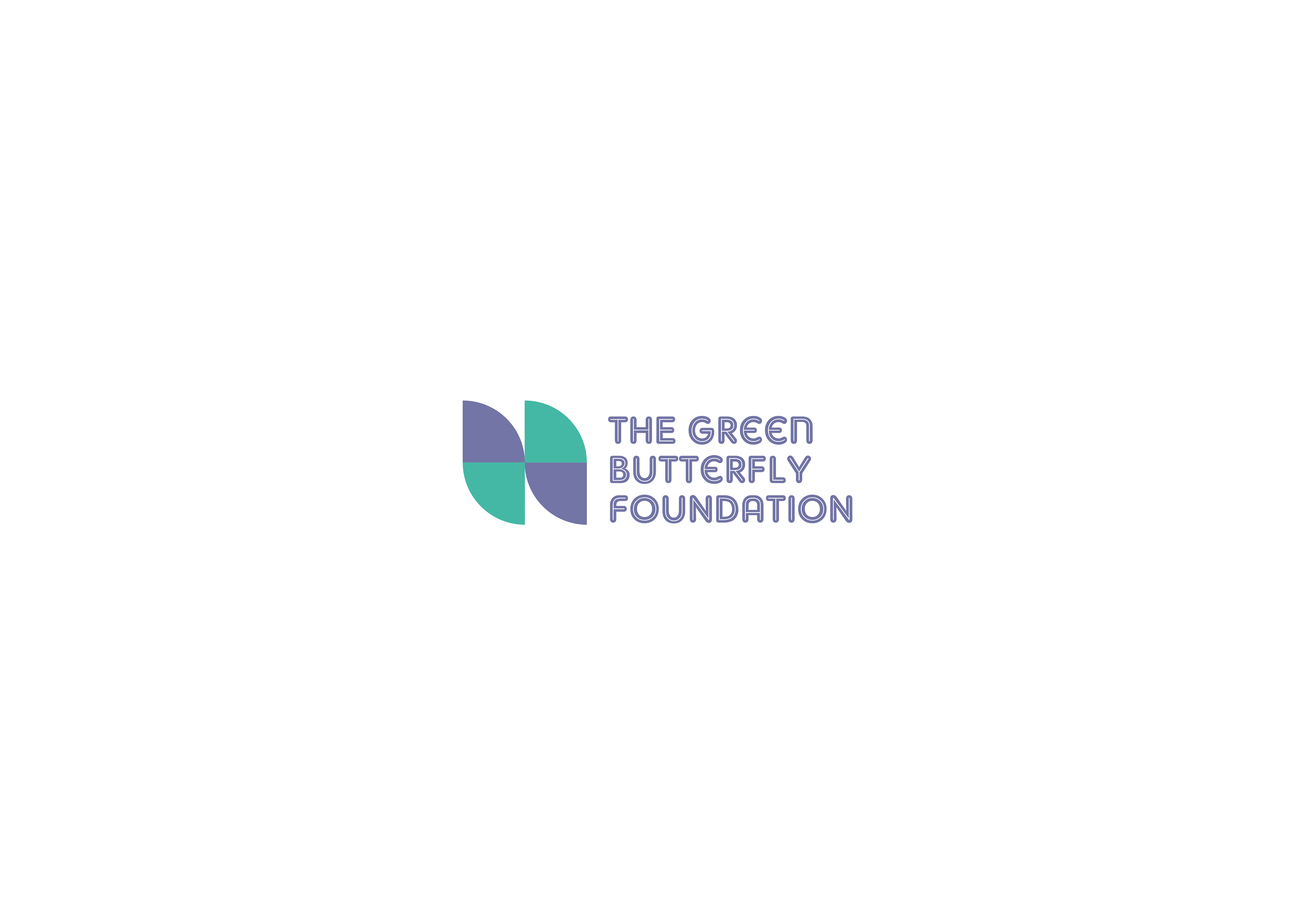
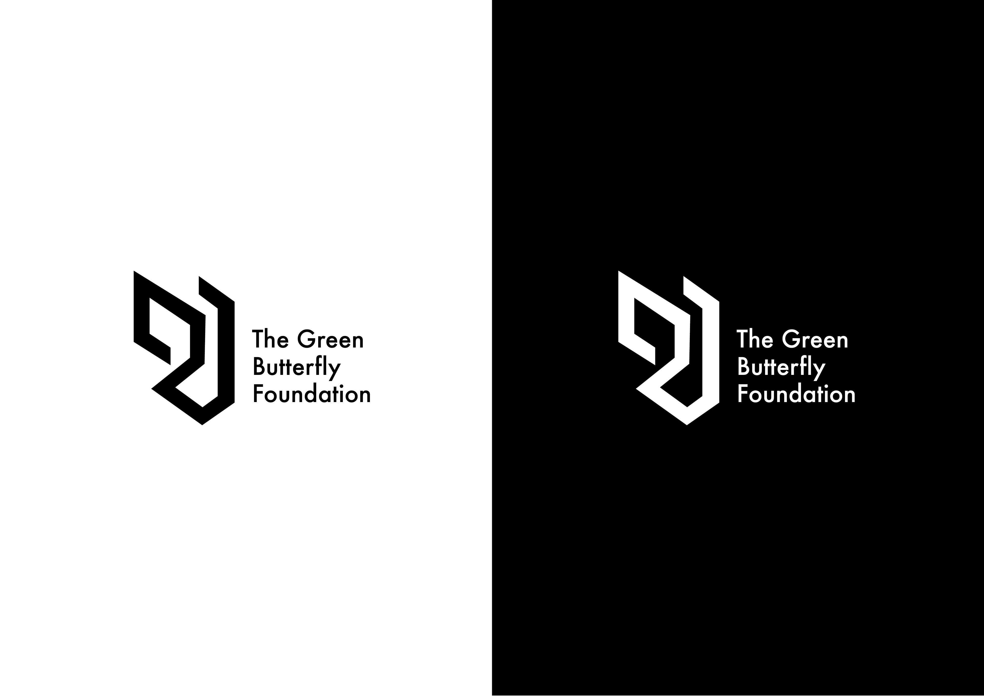
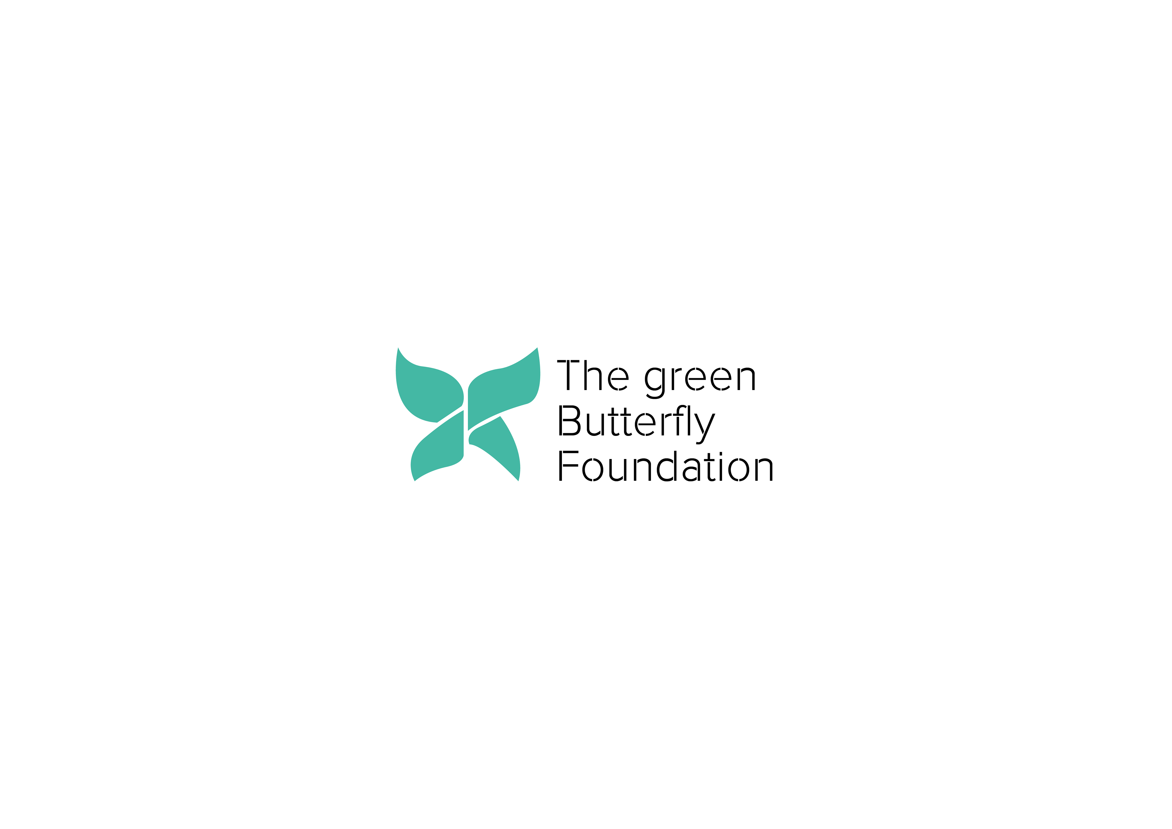
The second proposal was the design chosen by the clients. But in agreement it was decided to increase the size of the logo mark and change the typography and remove the word foundation.
1st logo version TGBF
Final logo version TGBF
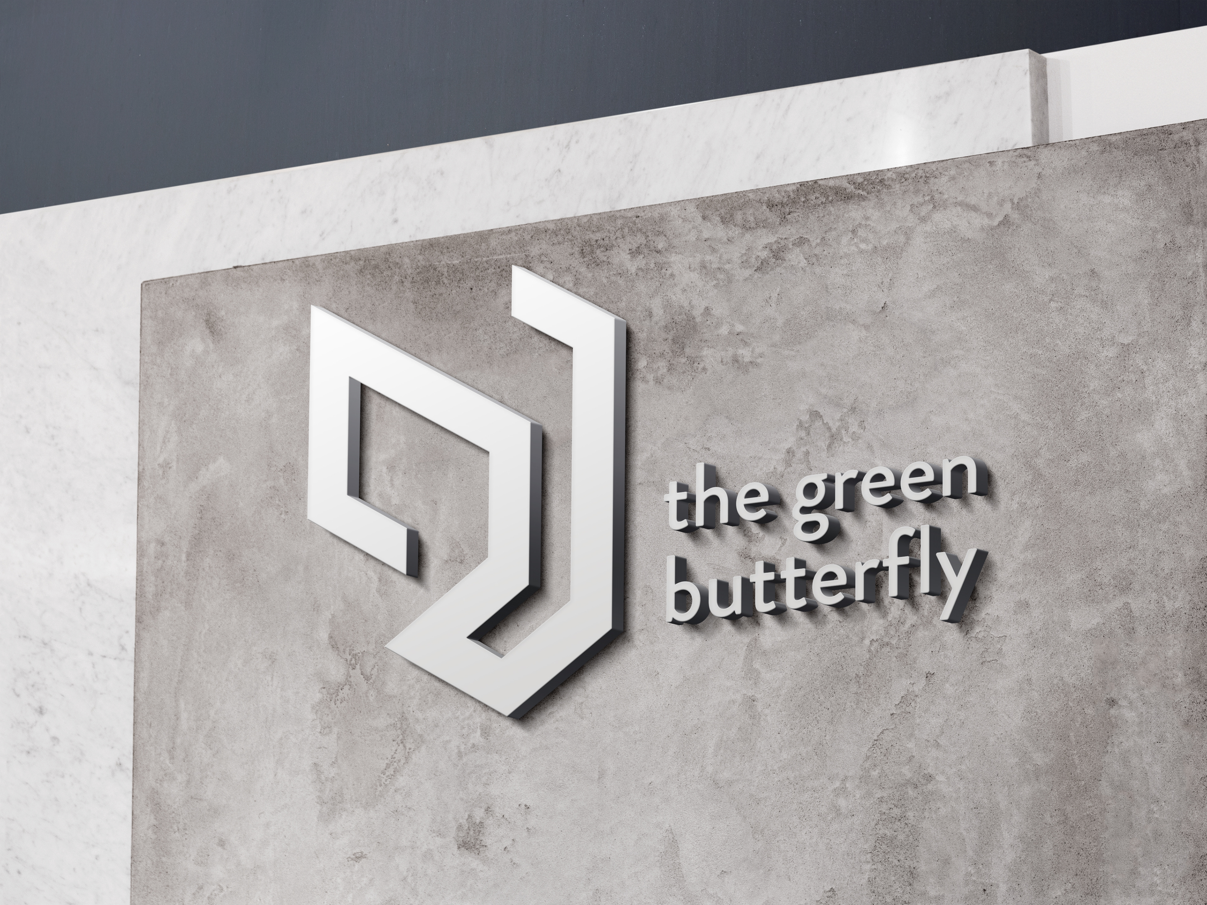
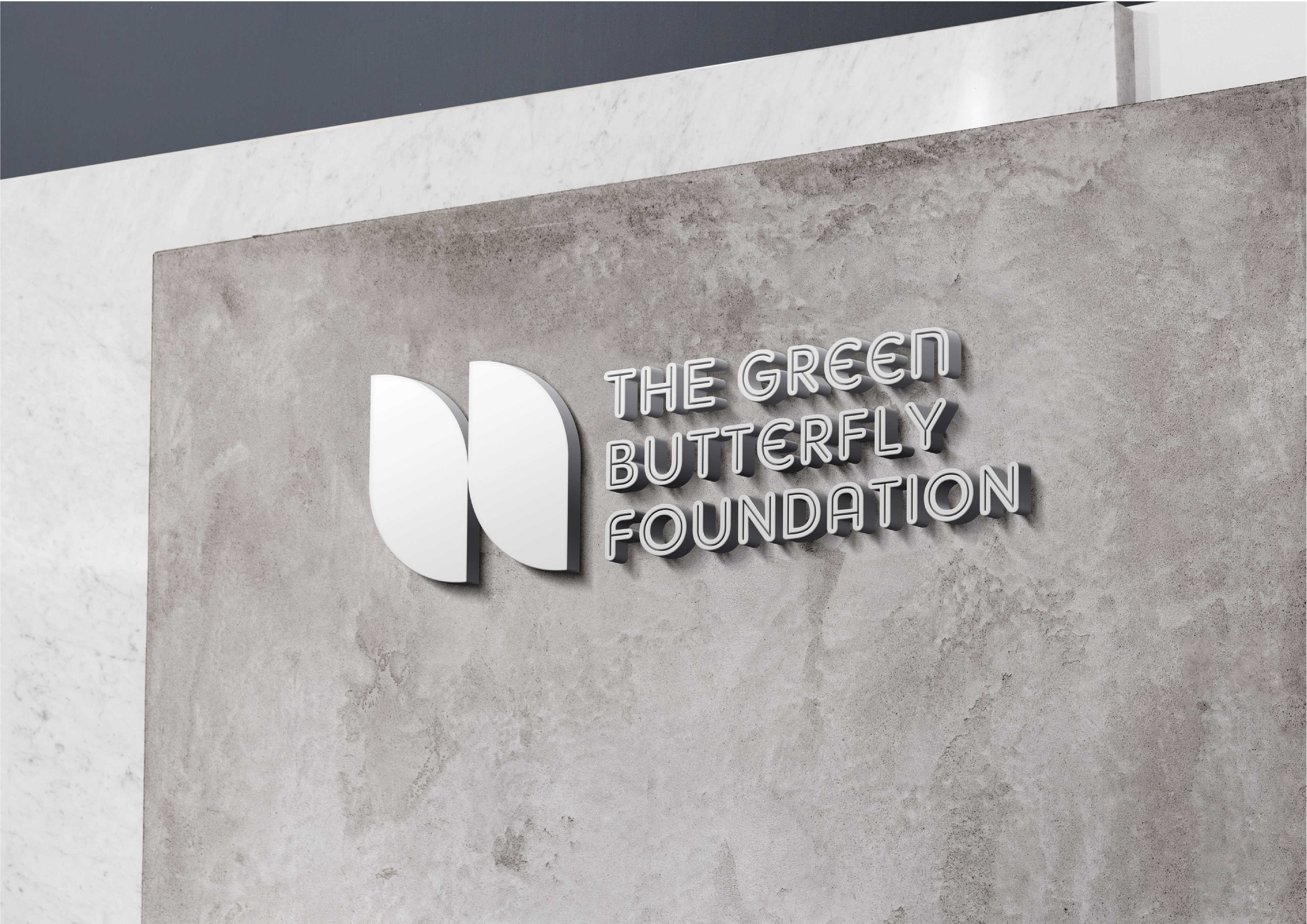
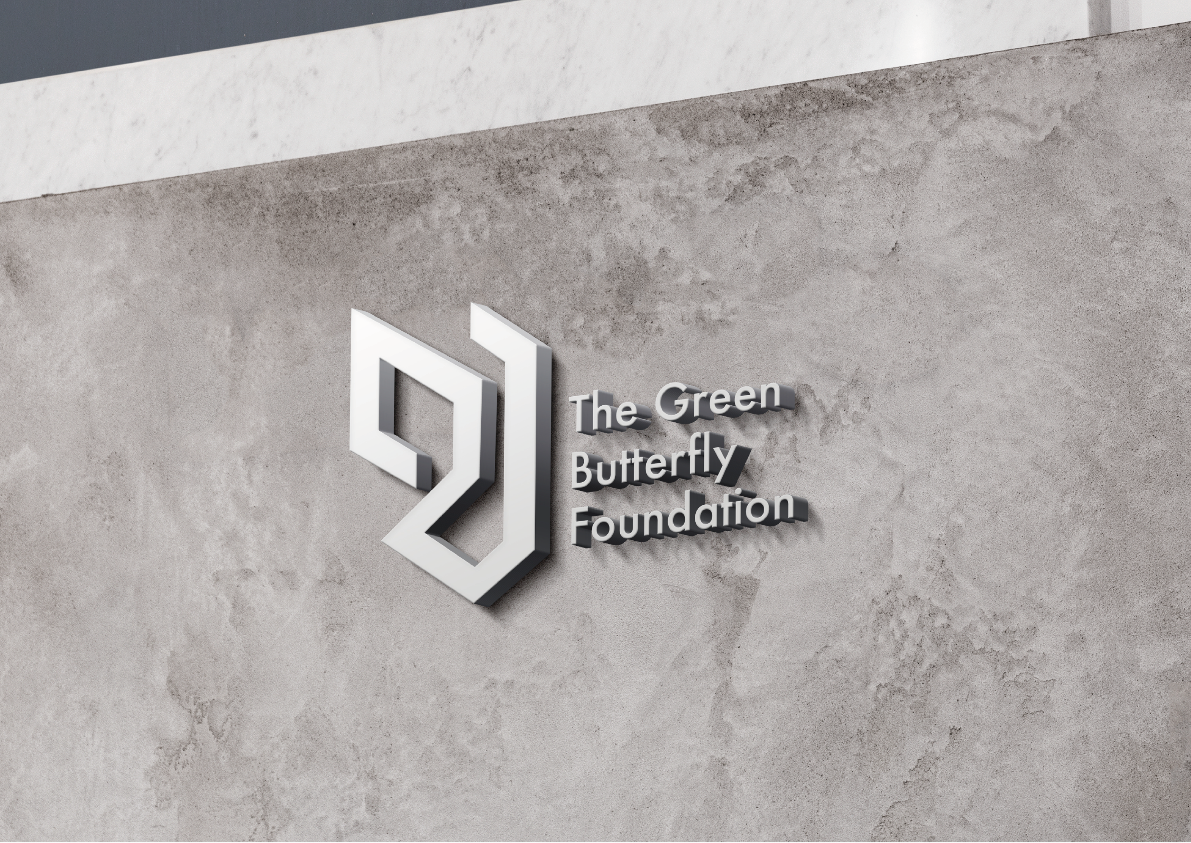
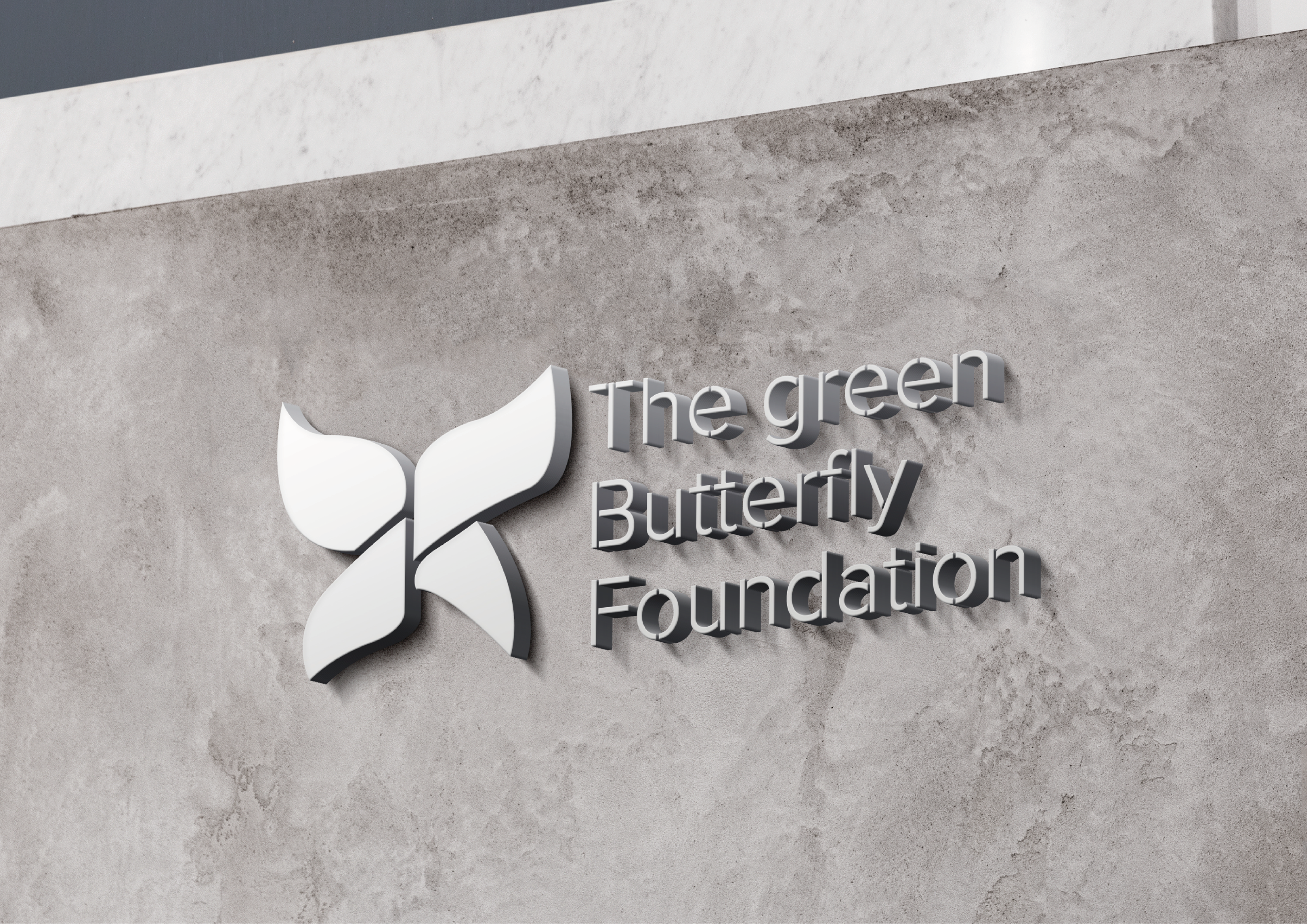
Mock-up of TGBF's logo in a wall sign
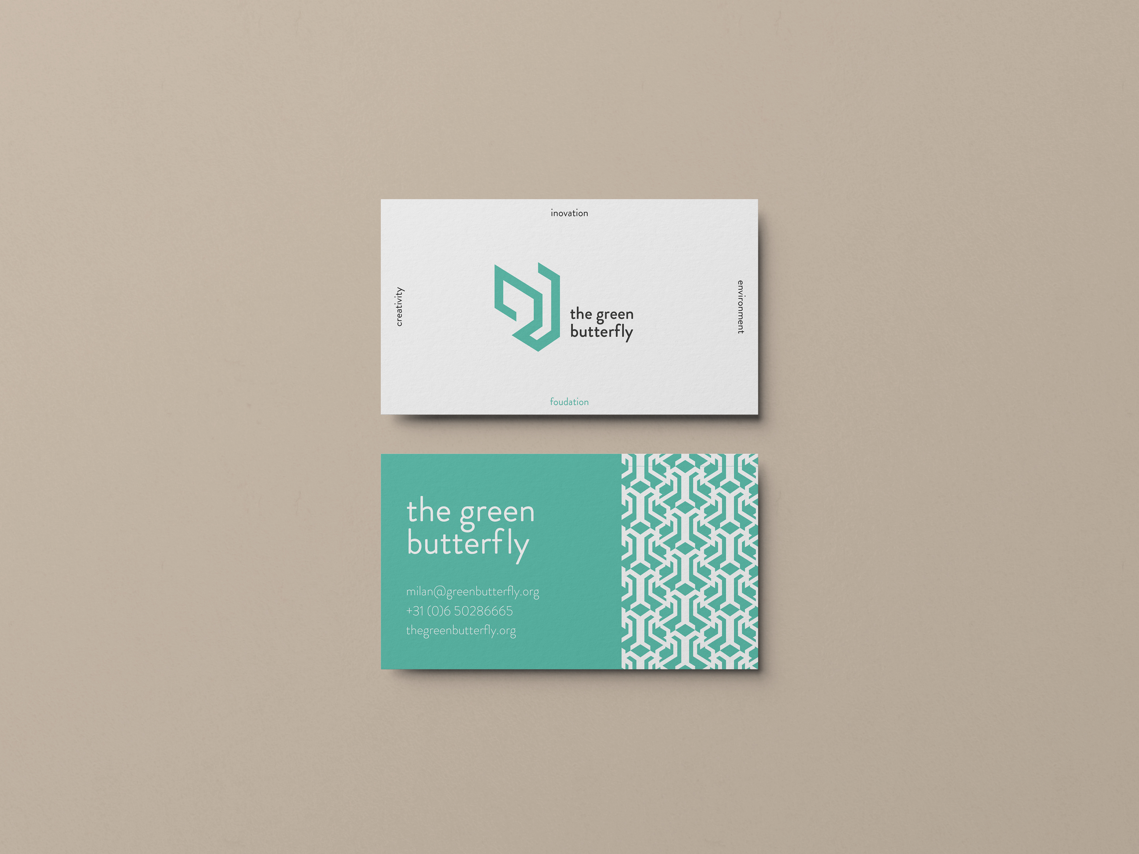
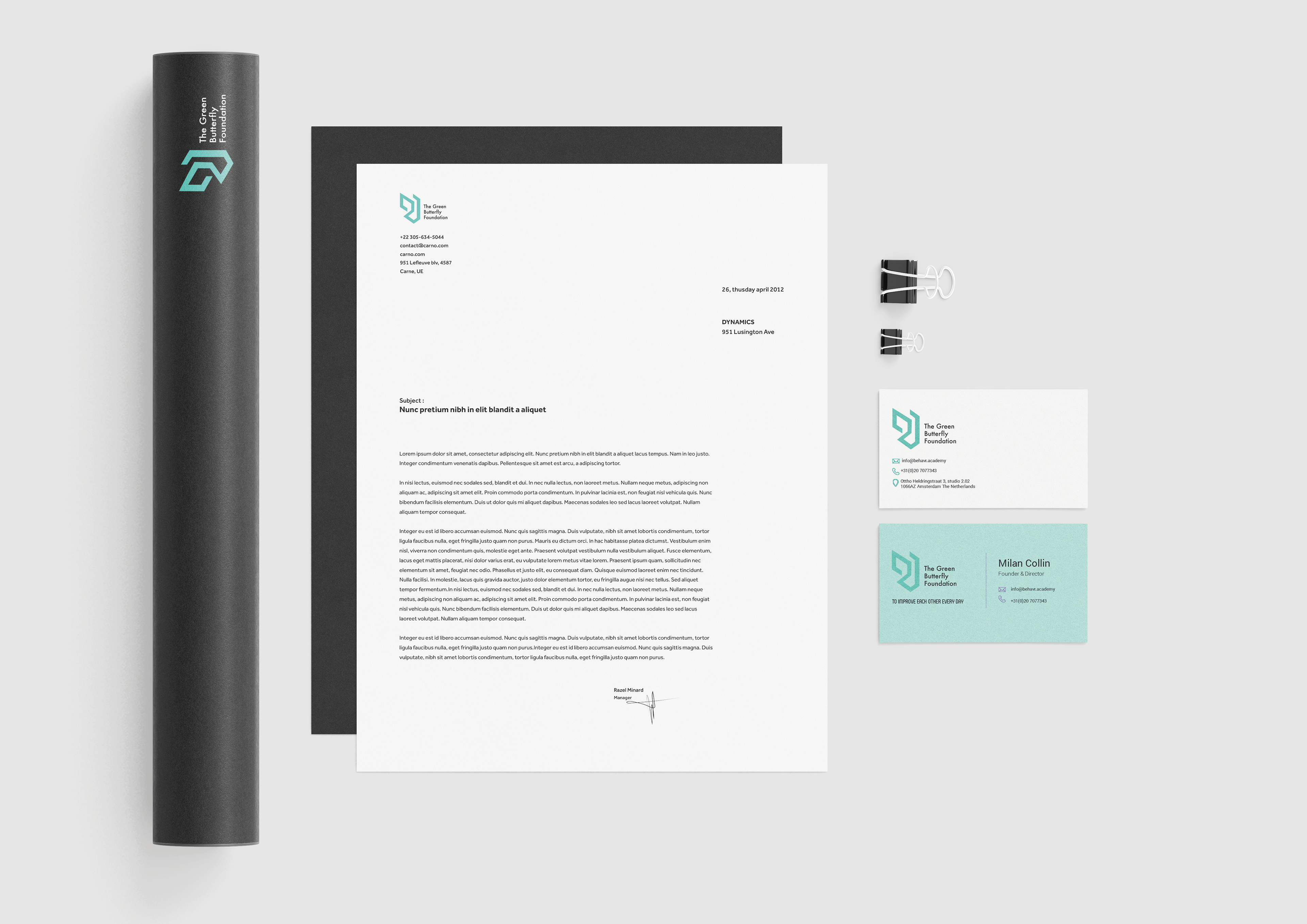
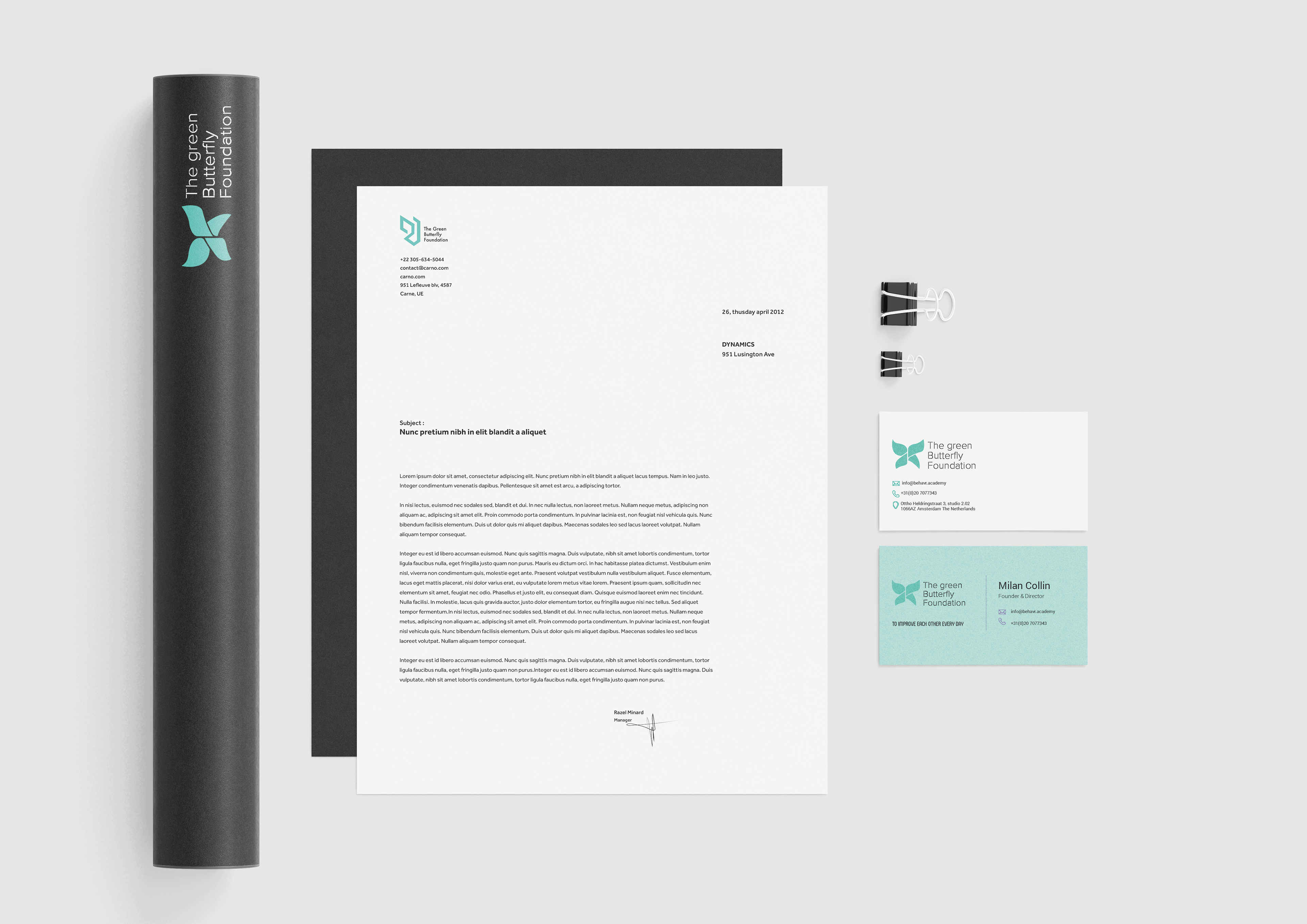
TGBF's business card design
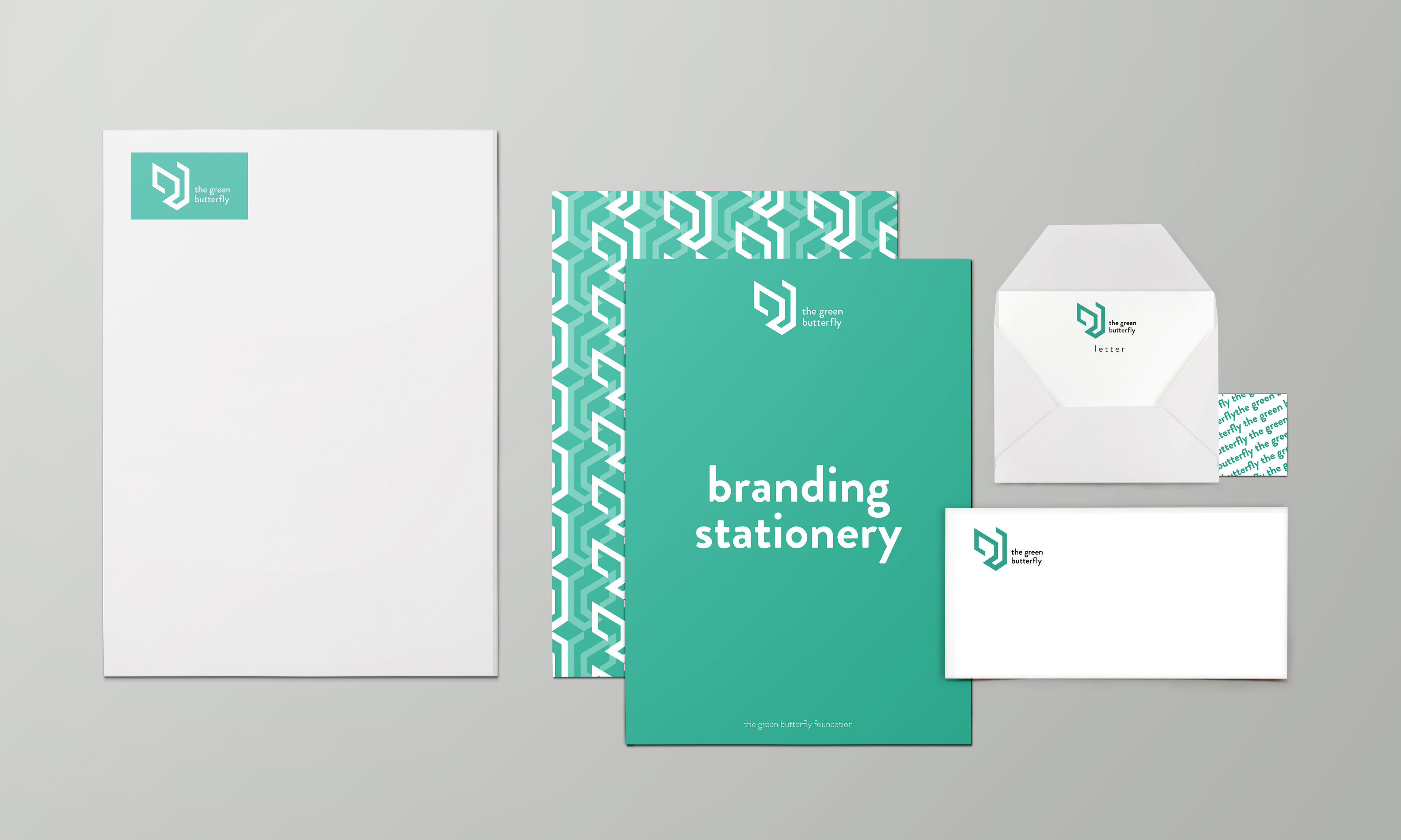
TGBF's stationery design
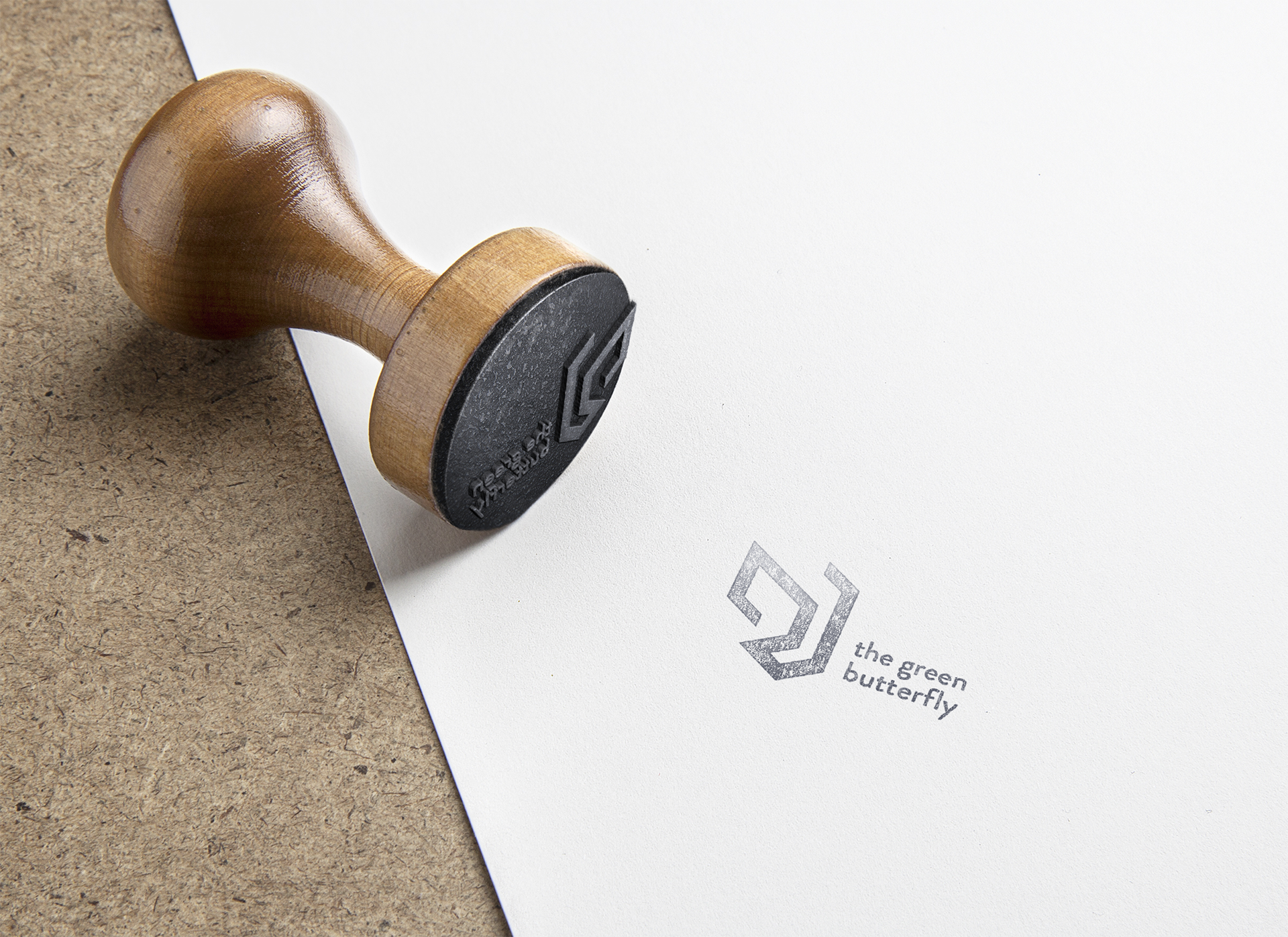
TGBF Stamp
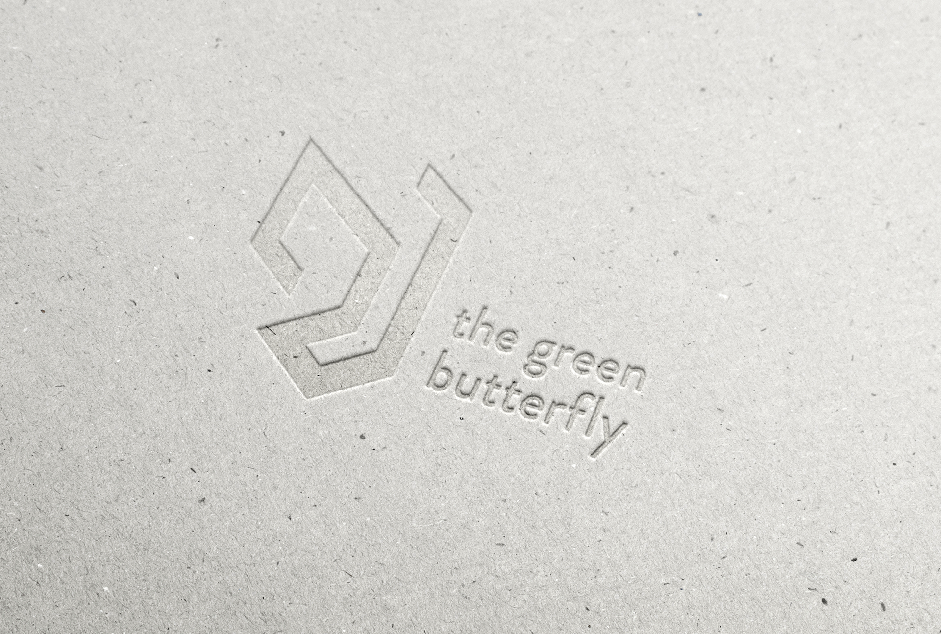
TGBF's brand identity with embossing technique
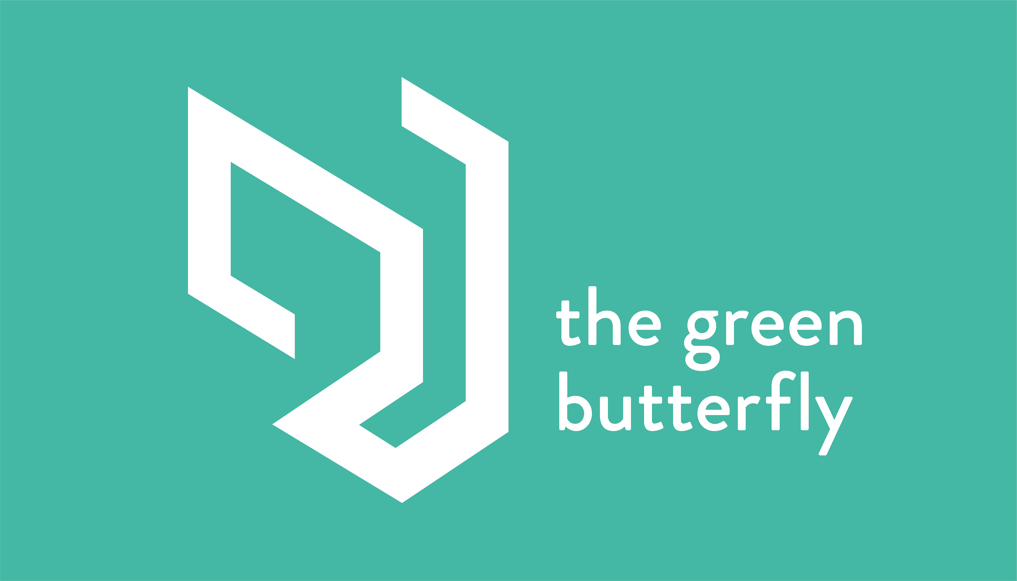

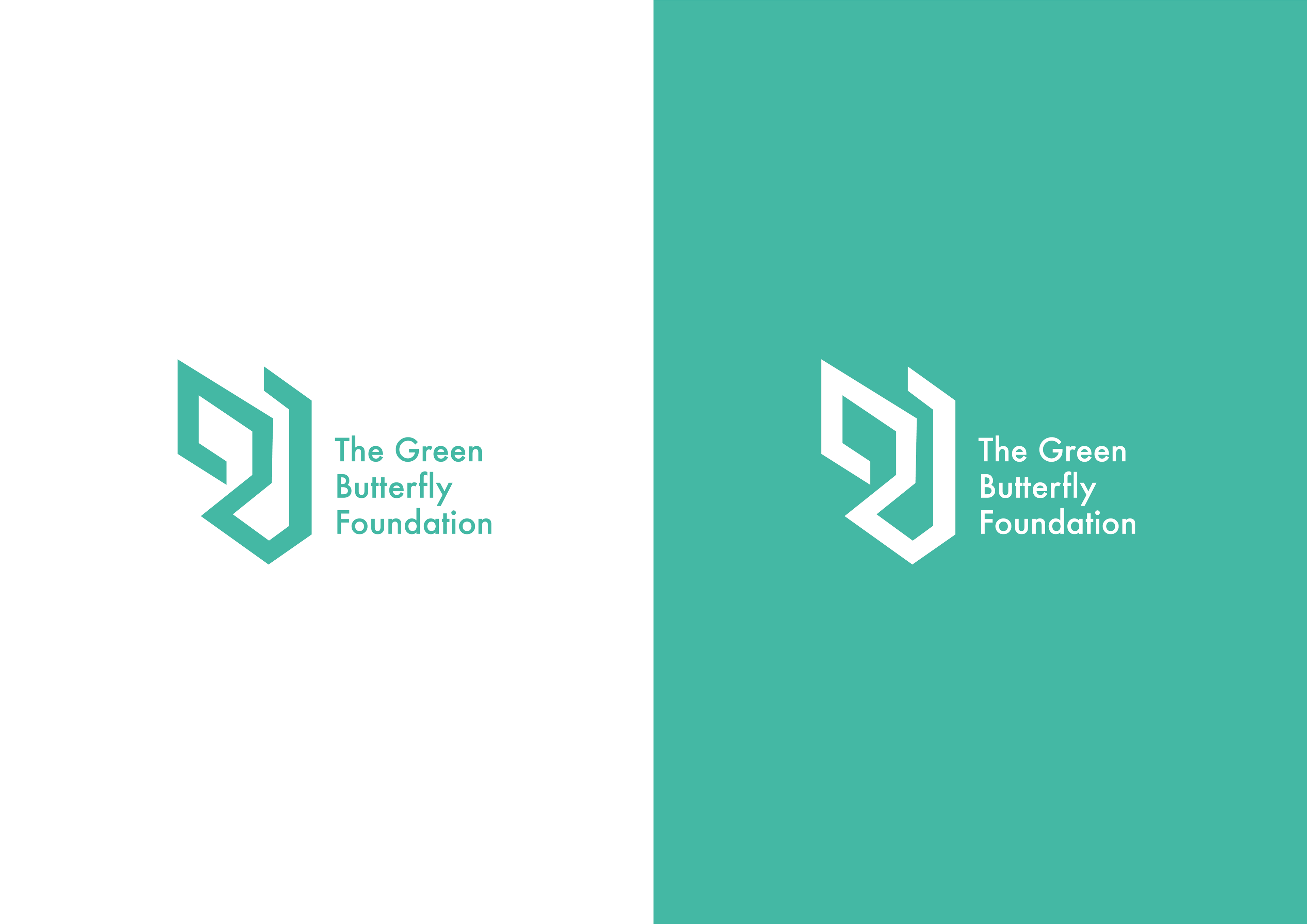
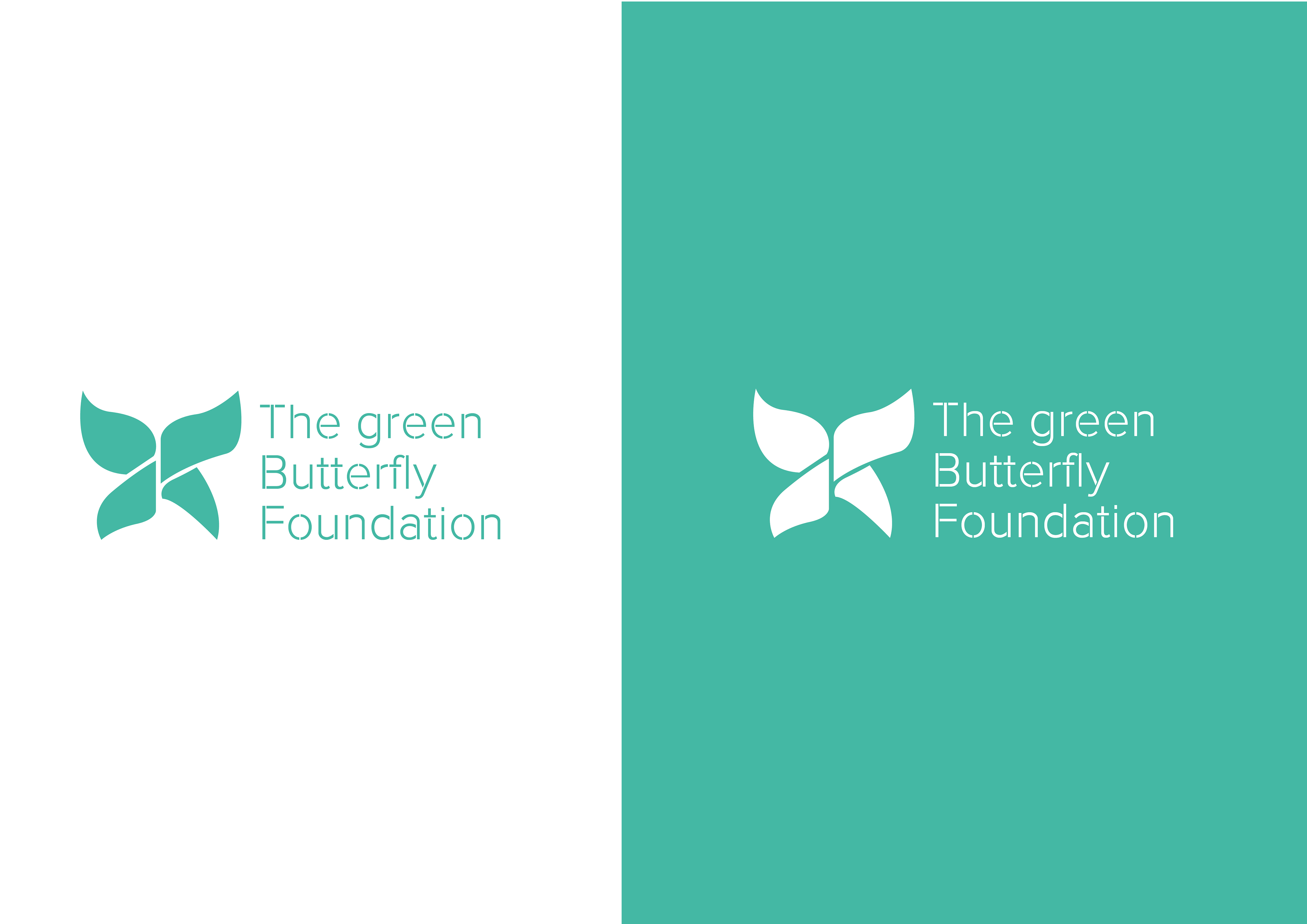
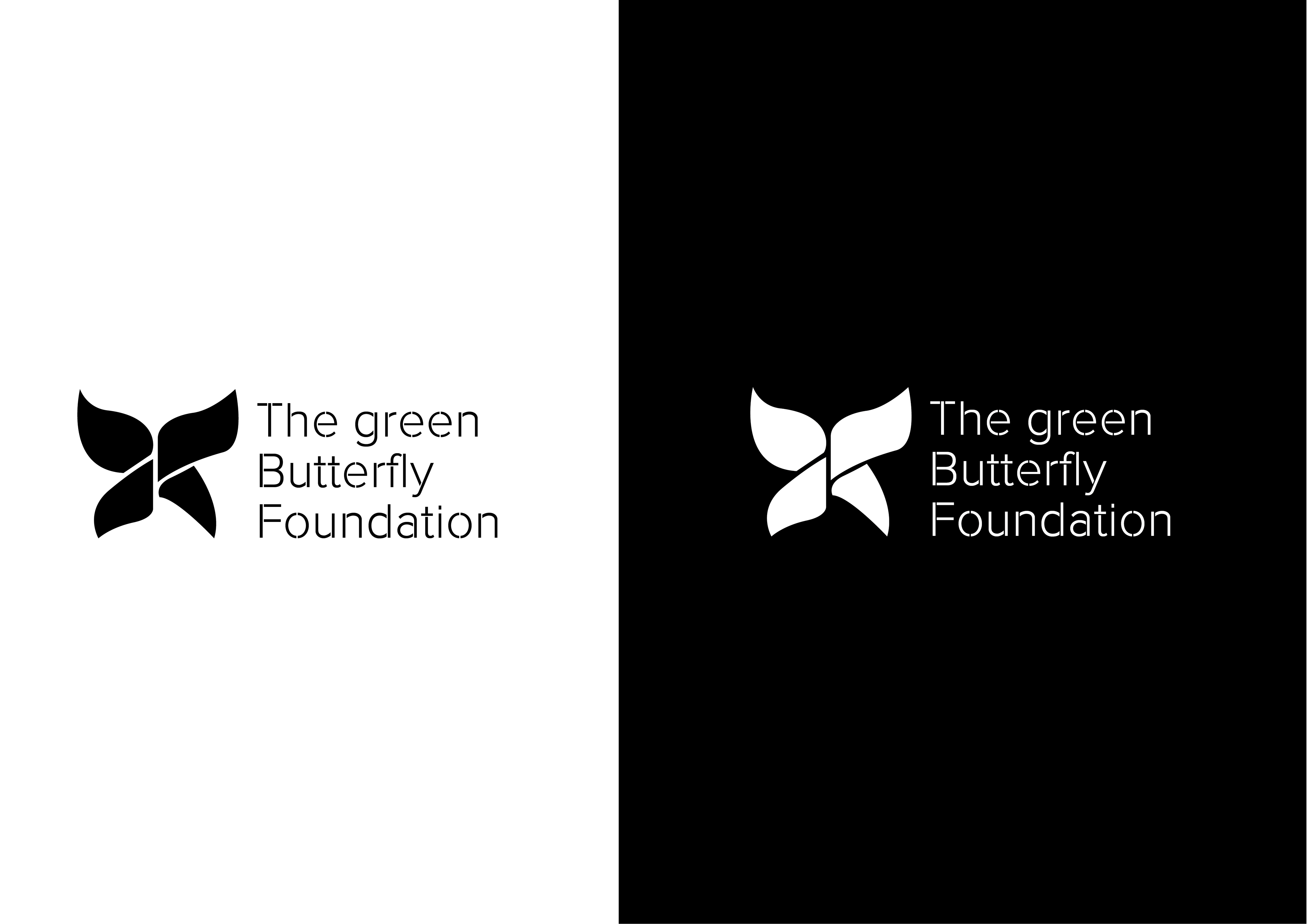
The standard version of the logo is with the green colour and it should be use across all the media.
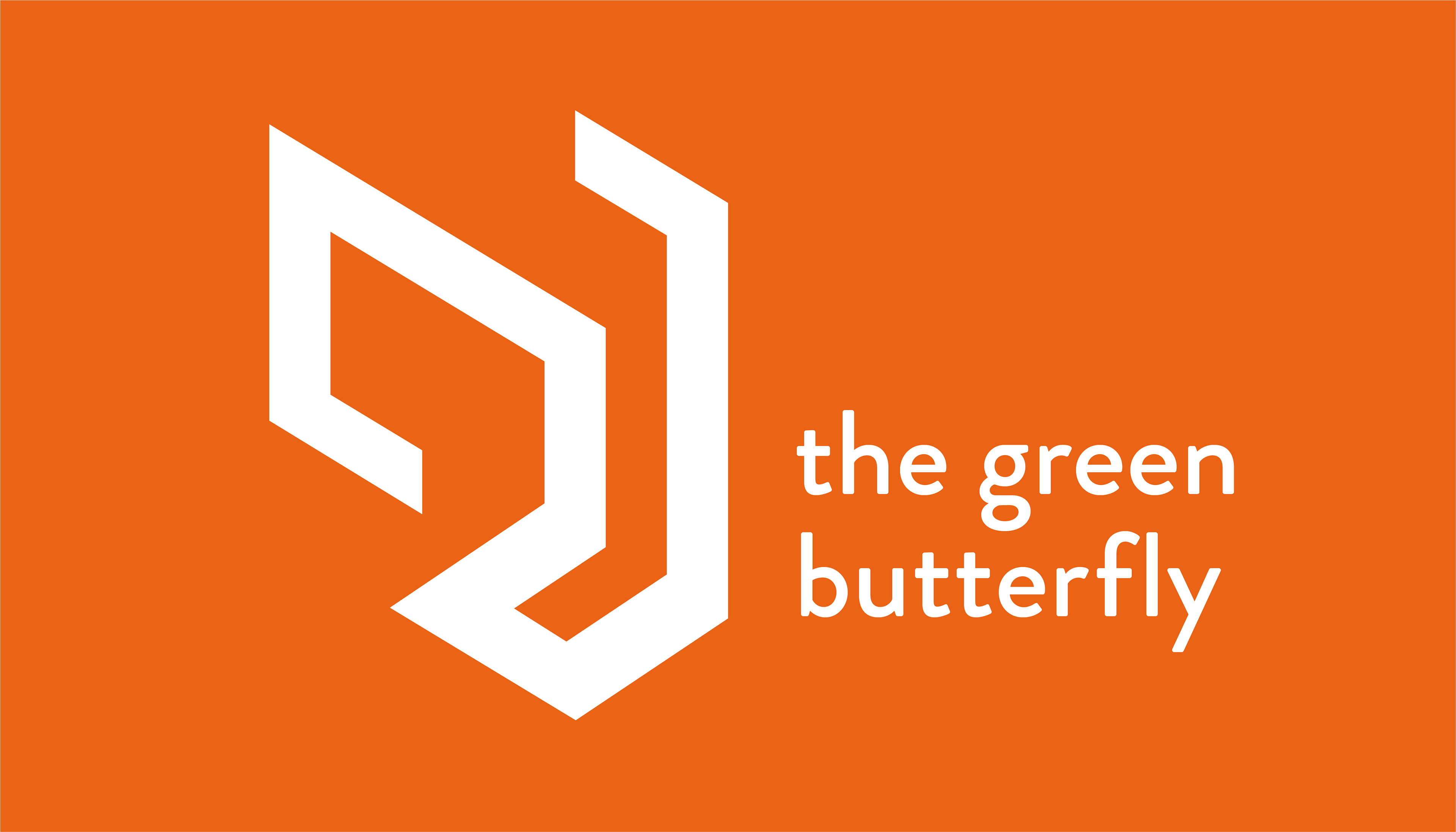
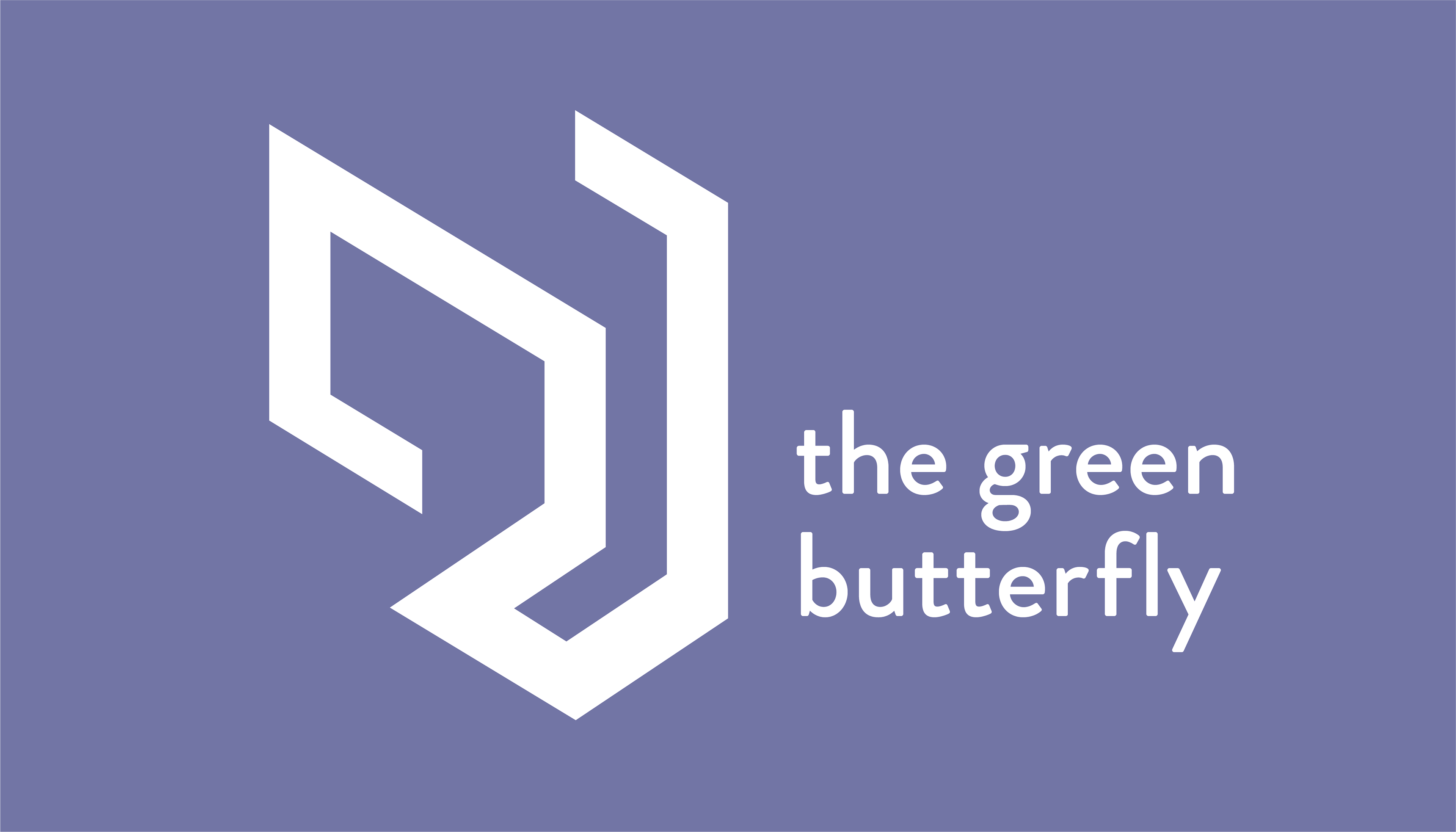
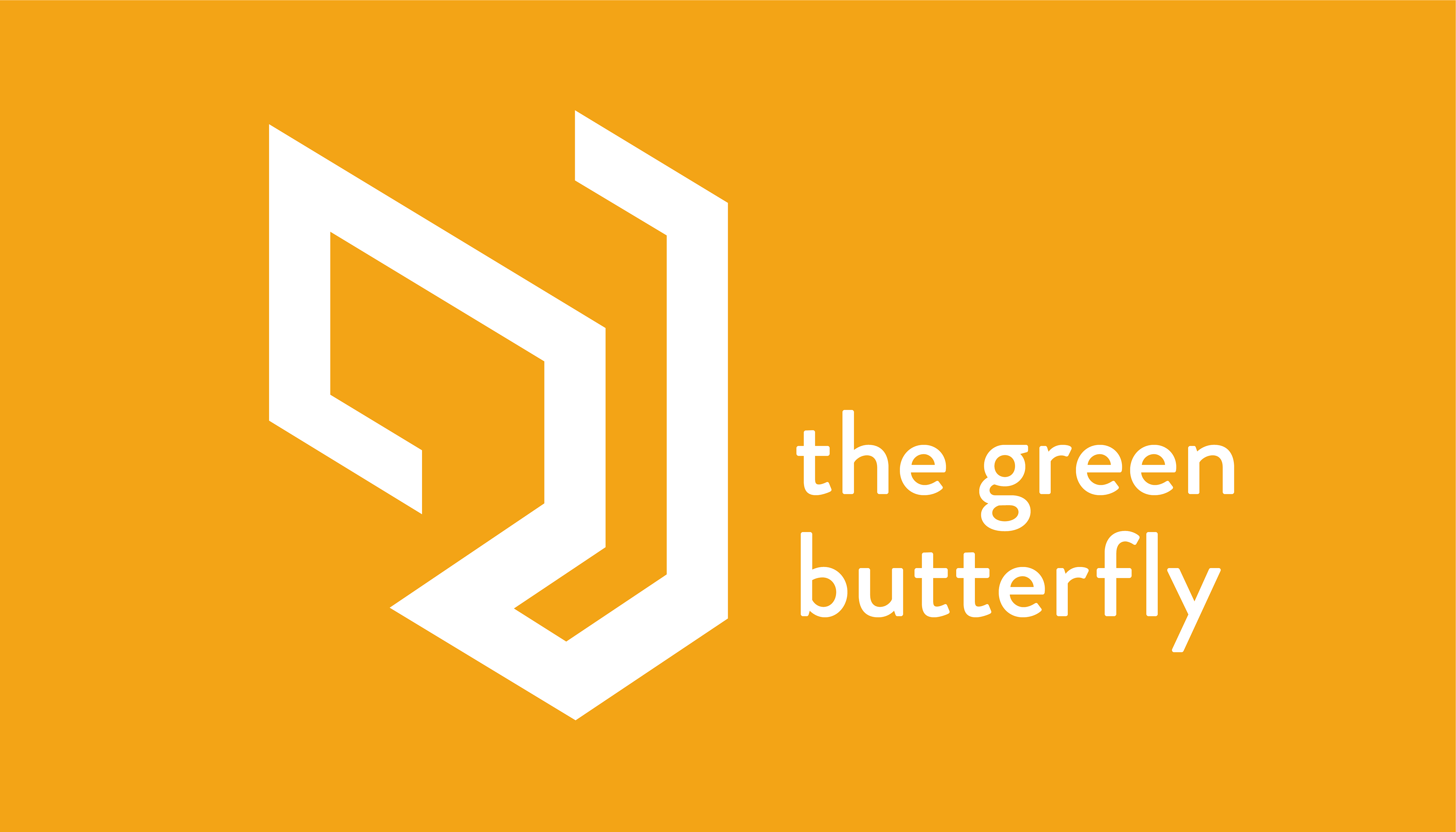
However, there are 5 different colours that can be use according to the season or type of project as substitute of the stardand green. These colours are green, pink, yellow, orange and purple.