Brief
Design a visual identity for a security framework that helps network operators make more informed and secure routing decisions. Create a mascot as a symbol of the security of the network.
Target audience
Male and Female users and companies that use the software to enable secure connections.
Solution
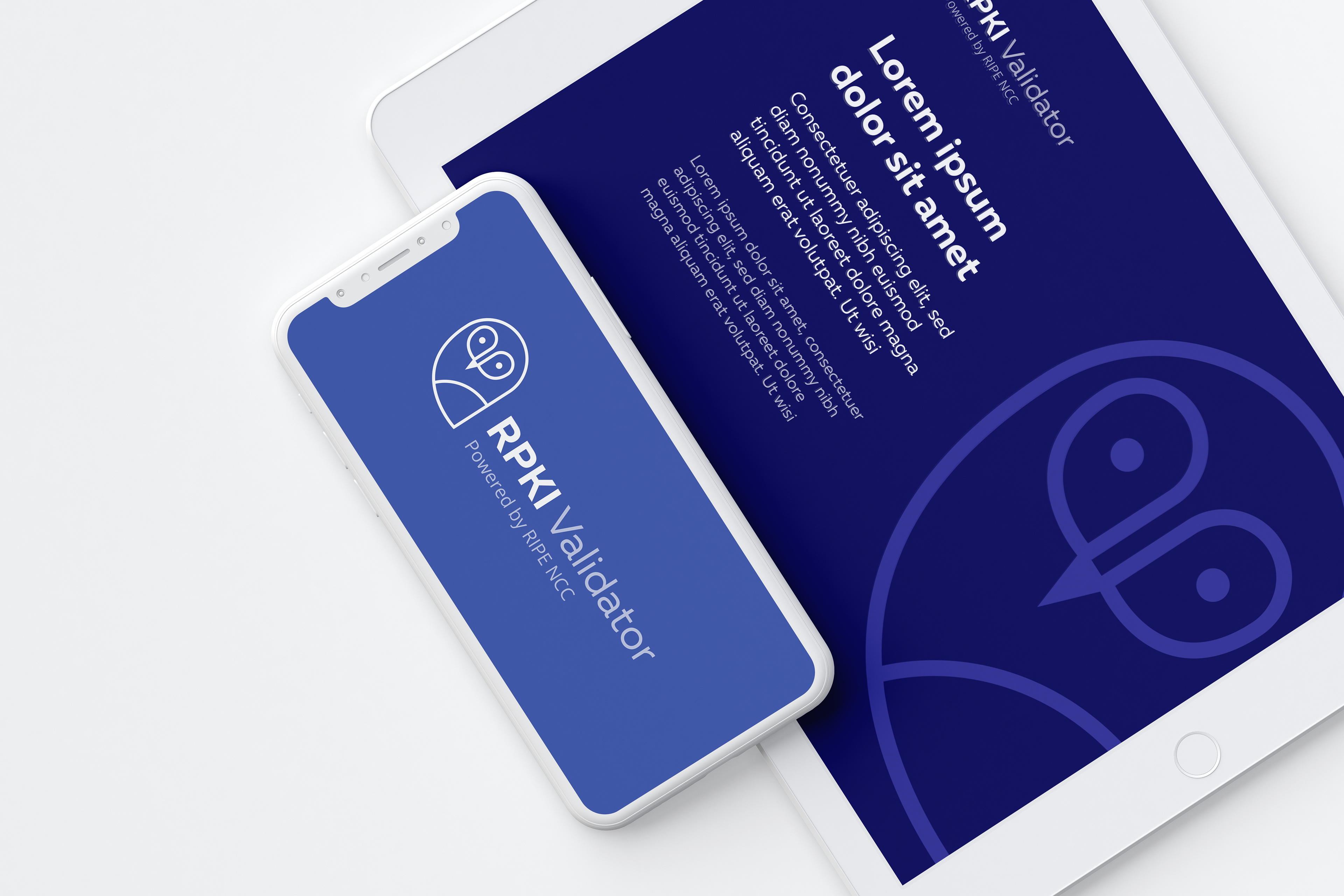
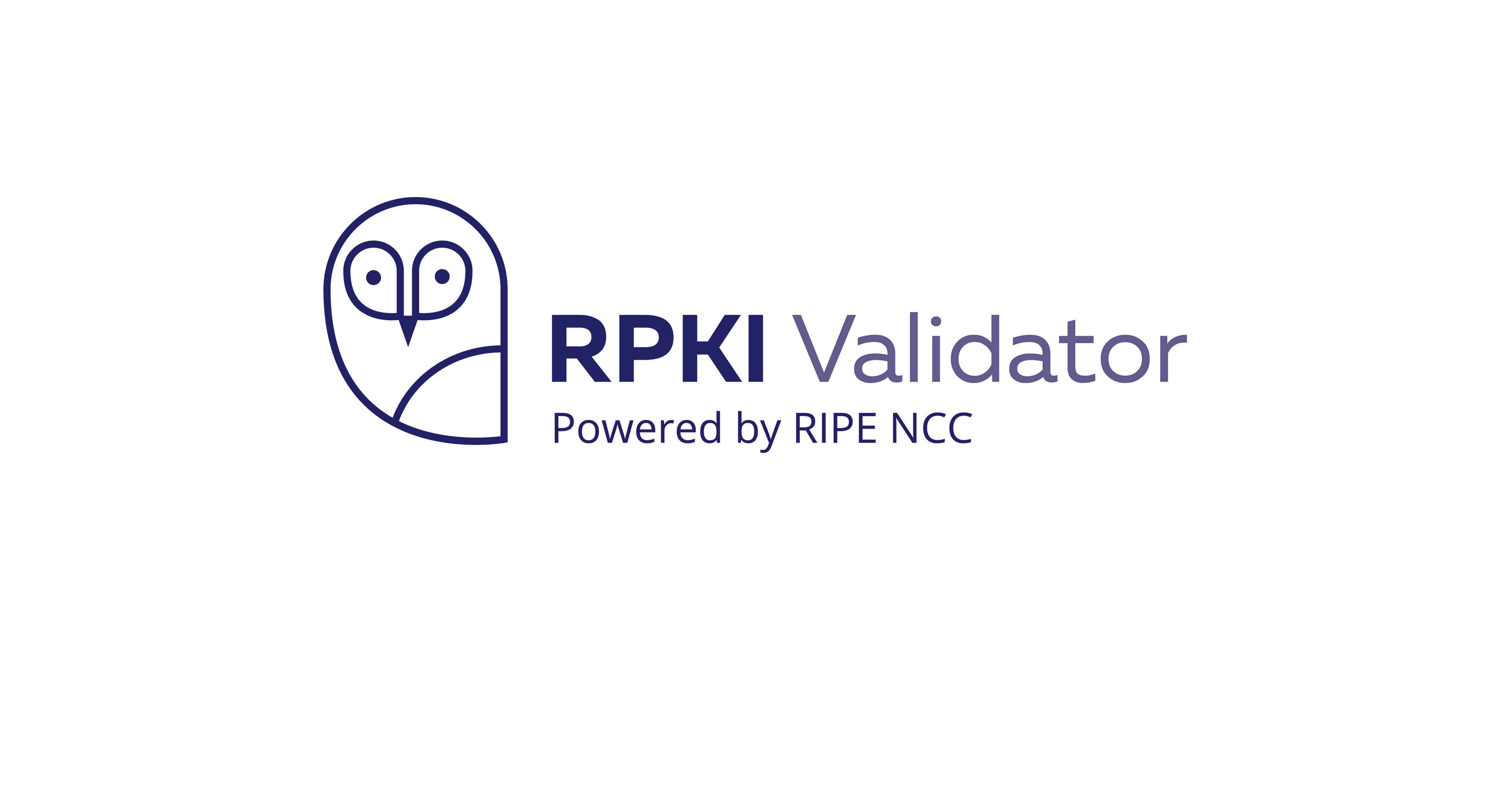
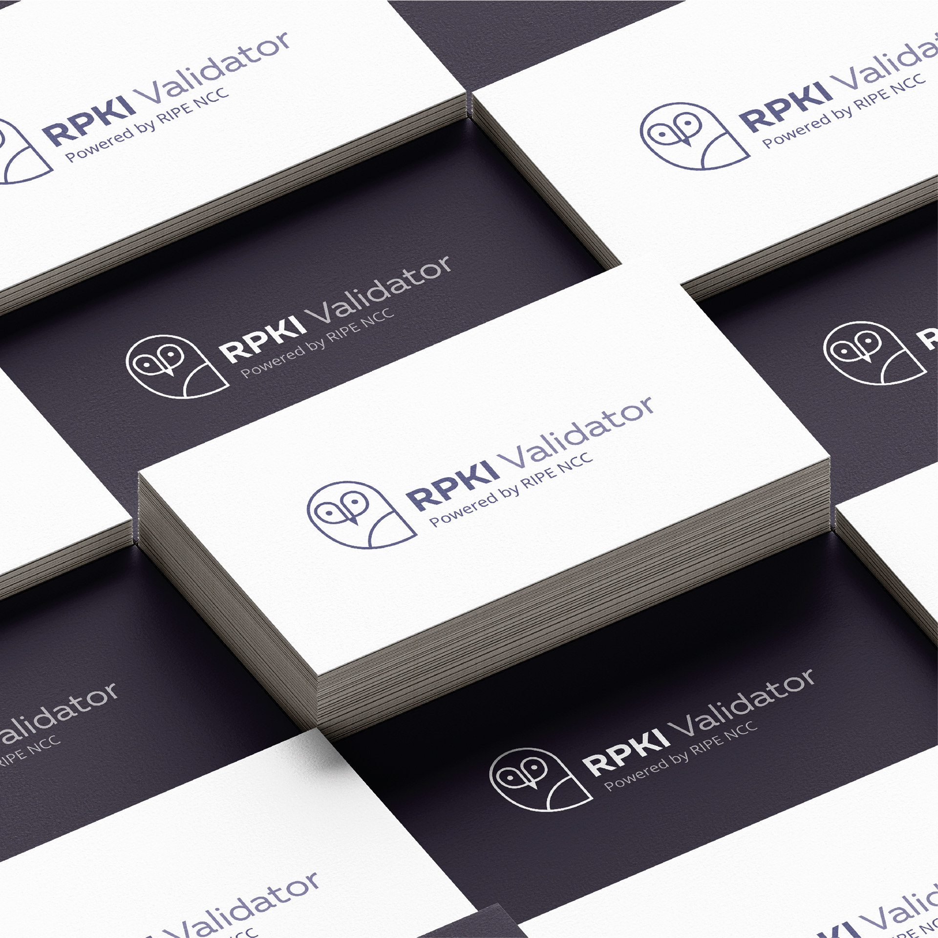
After researching and testing different options for the mascot, I decided to design an owl as due to its symbolic meaning of wisdom and alert, as it goes with the premisses of the service RPKI provides. I chose to use a typeface that works in web as this is a service that works mainly on the web. The colour blue was chosen as it is associated with calm, security and truth-worthy.